THIBAUT GUFFOND
OBUSITE


A survival-horror game inspired by WW1 and the paintings of Zdzisław Beksiński.
Made during my final year of bachelor, OBUSITE explores the themes of war, mourning, trauma and art as a way to cope with it all through first-person gameplay and dark atmosphere.
During development, the emphasis was on ambience and feelings rather than complex gameplay. This means that I had a different approach for my design of the game system: I put extra emphasis around the experience and the feelings I wanted the player to experiment before any considerations of challenge or balance. The result was a game that closely followed our expectations about player experience and progression.
Design highlights
Artistic Direction
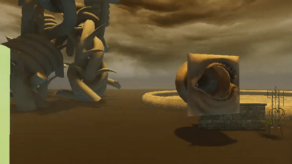
OBUSITE was built around a strong aesthetic vision: the fusion of a realistic WWI battlefield landscape and the nightmarish style of Zdzisław Beksiński's art. Thus, our artistic references included mainly historical photographs of the Great War and many of Beksiński's paintings.


As the game takes place in the post-traumatic nightmare of a retired soldier, we had a lot of freedom in the design of the world. We wanted the game to look like a distorted version of a no man's land, and we achieved that by applying some touches of Beksiński's style to the environment, characters and assets. The distinctly recognizable alien-looking texture of the paintings gave an organic, dirty and rotten look to objects. It also contributed to the delirious, nightmarish ambience of the game. We also chose to keep a palette ranging from pale orange to green-blue, just like the paintings. Not only did it give a nice cohesive look to the world, it also had practical applications in gameplay since the strong constrast between blue and orange helped the player instinctively tell apart the beneficial from the dangerous.
We also used a stylistic contrast between the gruesome, organic aspect of the battlefield areas and the Art Nouveau-inspired decorations of the safe zones.
Game Loop
At first, OBUSITE was much more aimed around base-building and resource-gathering. The player spawned in a garden acting as a central hub, which was in a derelict state at the start of the game. Multiple exits led to different areas, each with a specific kind of obstacle and resource. Each type of obstacle could only be overcome with a tool crafted from the resource of another area, establishing a clear path of progression with short-term goals inspired by famous survival-craft games (Valheim, V Rising, etc).
The areas and objects of the game were designed around this principle : a forest of giant barbed wire trees, with barbwire bushes blocking the path that could be cleared with a wire cutter ; a graveyard filled with bones to collect and an underground part requiring light ; a gas-filled trench section that killed the player if they did not wear a gas mask...
Early prototype of the player picking up and using the wire cutter
In addition to the resources found in each area, the overarching goal of the player was to upgrade the garden hub and restore it, rebuilding the ruins, regrowing the plants, cleaning the fountain, ultimately turning the nightmare back into a dream. This was done by collecting pieces of trench art scattered around the map and bringing them back to the hub, a metaphor of real, historical trench art - objects made from scavenged shells and bullet cases - that helped many soldiers cope with the horrors of the Great War.


Examples of trench art
As production started, however, we realized we scoped too large and would be unable to produce enough assets to populate the six sublevels that were originally planned. Simply cutting it down to one or two wouldn't work because this type of game loop needs enough separate stages in order to be engaging, otherwise the whole sense of progression is lost. I then decided to completely change the gameplay loop to something that could work even with a reduced level and playtime.
The resources and building parts were entirely removed, and the challenges of each area were rethought accordingly. Only the barbed wire bushes and wire cutter were kept as they were, but the wire cutter became an item that had to be found on the map rather than crafted with resources.
Not counting the hub, there were three playable areas in the final game. All of them contained a monster encounter that could be either a pursuit phase or an infiltration phase.
The first area was a graveyard prowled by a monster, with hiding spots and a secret tunnel allowing to cross it in a safer way for perceptive players.
The second area was a trench section with a monster chasing the player and a disorienting tunnel filled with ghostly hands trying to grab the player.
The third and last area was a bombed village with another monster chase ending with a path that led through poisonous gas, requiring the player to move efficiently in order not to suffocate (the gas mask was not present in the final version).
This redesigning of the game loop into a much more linear experience was also important to fit the requirement that the game had to be finishable in less than 15 minutes, as it was to be played on the day of the final exam by the judges.
Redoing the gameplay entirely required of course a lot of playtesting. During the production phase, we adopted a rythm of one playtest session per week, with testers from outside the school. Some of them came almost every week, but we managed to have at least one new person each week to make sure the game was playable for someone with no prior experience of it.
Those playtest sessions helped us a lot to refine the experience, especially regarding the clarity of objectives and of the level design. In the first sessions, most people had a lot of trouble understanding where they should go and what they should do. We adressed this with multiple changes:
-
Instead of a hub connecting multiples areas, the garden became an entry point for the first area only, and they became connected to each other linearly;
-
The UI was improved by adding a reminder of the current objective;
-
An NPC (taking the shape of a ball of bright light with the voice of the protagonist's wife) was introduced to guide the player along the way.
Thanks to these changes, we managed to keep the game length at around 15 minutes even for first-time players, and most players managed to finish the game on their first run without getting lost.
Post Mortem
In is final state, OBUSITE was praised for its strong theme and artistic direction, and players reported strong feelings of fear and excitement combined while playing, which was one of our experience goals. Most people were able to finish the game and understand the story, and expressed enthusiasm at the idea of playing a longer version.
However, OBUSITE was still very far from a flawless experience.
-
Some people complained about the lack of challenge and the railroading of the player, feeling that the game was too easy;
-
Some other people complained that the monster chases were too hard because of an optimization issue that reduced the framerate during chases;
-
The landmarks that were initially supposed to guide the players and help them find their way were not visible enough and most players did not even notice their existence;
-
Some people had a hard time understanding how to overcome the poison gas part.
To adress the difficulty issue, I think a good way to allow the less skilled players to overcome the challenges without ruining the fun of the more skilled ones would be to have offered alternative paths and ways to circumvent the chases, rather than always forcing the players into them. It would also have enhanced the importance of player choices and gave them a more meaningful experience, resolving at the same time the problem of the skilled players.
The landmark visibility was something we tried to adress multiple times, making them bigger and bigger, yet it apparently did nothing to make them stand out more. Thinking back on it, I think now that we should have tried to make the level less cluttered to reduce visual noise, and we could also have used more verticality to control the player's field of view.
Finally, for the gas section, the problem was that players received strong negative feedback (in the form of the character coughing loudly and a green bar with a skull icon filling up) while at the same time they were expected to keep going and ignore those feedbacks to get to the other side. Even with the guidance of the NPC becknoning them to walk into the cloud of gas, some players found it so counterintuitive they thought there had to be another way around it. I see two potential solutions to this issue: either we could have indeed prepared another way to get around the gas (which would also have had the advantage of being in line with the potential corrections mentioned for the other issues), or we could have added clear signals and information to better guide the player through the gas cloud.